The zigzag indicator is not really an indicator. It is used to illustrate the price trend in clear form, filter out less significant price change and noise.
Zigzag indicator using percentage of difference in its construction. When a swing low or high is more than the percentage, the line is drawn. Other swings high or low that are smaller than the percentage of changes are ignored. The ZigZag indicator did not have predictive power.
Usage
Zigzag indicator used to highlight the trend. It can be used to determine the direction of trend. It however does not indicate timing for entry and exit. The line is redrawn based on changes of the price.
Another use of ZigZag indicator is to ease the wave count. Many traders use zigzag indicator to count the wave in Elliott Wave form.
Here are some reference on ZigZag indicator:
http://www.forexrealm.com/technical-analysis/technical-indicators/zig-zag.html
http://www.traderslog.com/zig-zag-indicator/
http://stockcharts.com/school/doku.php?id=chart_school:technical_indicators:zigzag
Read more!

Showing posts with label forex indicator. Show all posts
Showing posts with label forex indicator. Show all posts
Friday, 12 November 2010
Thursday, 30 September 2010
ATR Indicator
ATR stands for Average True Range. This is another famous indicator developed by J. Welles Wilder. In short, this indicator indicates the volatility of the market at particular time. This is not a directional indicator; it does not indicate the direction of the prices. Lets look into more details below.
What is a true range?
Wilder quantify the volatility of the market with true range. A true range is the greatest among the following 3 items.
- Current high minus current low.
- Current high minus previous close.
- Current low minus previous close.
The true range is always positive number. From the calculation above, we know that the true range (volatility) will increase when: there is long candle, or when there are big gap between candles.
Average True Range.
Average True Range is the moving average of True Range. Usually the period is set as 14 for 14 moving average of the true range. The other favorite number is 21. The number can be customized to meet the trading needs.
Using ATR
ATR can is an indicator for market volatility. The value in ATR has no real meaning, because it is relative to each other. Some pairs will have larger value than other. Some use low ATR value to predict possible turning point of the price, however this is not always accurate.
Another way to use ATR is using it to set stops. This is because we need wider stops when the market volatility is high; and we can set narrow stops when the market volatility is low. Usually we can set stops based on 2 to 4 times of ATR value.
Another way to use ATR is avoid whipsaw. If we trading breakout, usually we enter once breakout occur, however whipsaws can occur too. By using ATR, we enter on breakout plus 20%ATR, this will give some filter against whipsaw.
To learn more about ATR, here are 2 websites that have more detailed information:
Read more!


Wednesday, 8 September 2010
basic: RSI (part 2, more information)
Not long ago I have posted about the Relative Strength Index (RSI). In the post I have highlight some way to use this indicator. Recently I have found out a bit more information about RSI. Here I would like to share out the few more points I have learned.
RSI vs EMA, RSI period
I read this in an article in Currency Traders. It is said that RSI is equivalent to EMA (Exponential Moving Average) two times the period of RSI. This is because the way RSI is being calculated. In the image below, I have plot out RSI 14 and EMA28. Notice that RSI will be below center line when the price is below EMA; and RSI will be above the center line when the price is above the EMA.
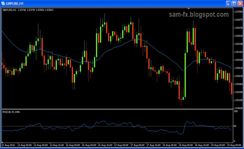
The default value for RSI is 14. It is said that the best period for RSI will based on the price cycle divided by 2. If the price cycle is 28 period, than RSI 14 is recommended.
Trend determination
RSI is a momentum indicator; however it can be used to determine a trend too. I learn this from an article by John Hayden. Andrew Cardwell have studied and developed many new usages for RSI. Using RSI to determine trend is one of it.
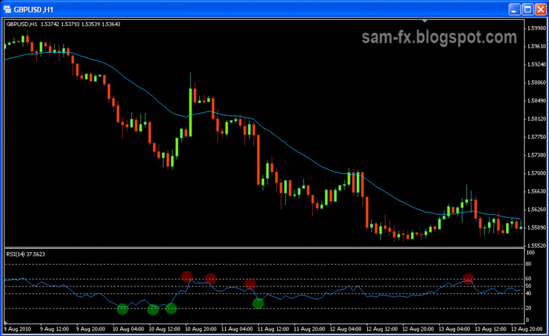
In and uptrend market, when the price is trending, the RSI will find its support around level 40 and resistance around level 80. The RSI will makes higher lows and highs.
In a downtrend market, when price is trending, the RSI will find its support around level 20 and resistance around level 60. The RSI will make a lower lows and lower highs.
In the example below we have a down trending market, with RSI around level 60 and 20.
Divergence in RSI
I read this in the article by John Hayden. What shock me is this is absolutely opposite from what I read from typical textbook. And what surprise me more is he is absolutely right.
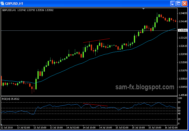
According to John, when bearish divergence happens in uptrend, he will think of Bull Market. In this situation he will be looking for opportunities to go long.
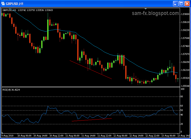
When bullish divergence happens in downtrend, he will think of bear market. In this situation he will be looking for opportunities to go short.
And this is very much correct. Below I have some few example of it.
Here you are, 3 pieces of important information for RSI. Use it wisely and it will bring more earning to you.
Read more!
Thursday, 26 August 2010
basic: Bollinger Band (part II)
Not long ago I have posted about Bollinger band indicator. Lately I have come across some more facts about the Bollinger band in my reading. Here I would like to share with you some of the important points I have come across. Although personally I not yet use Bollinger Band in my trading system, there are no doubt this is a good indicator and many successful traders using it.
Here are some additional points about Bollinger Band.
- Bollinger Band does not indicate buy or sell signals. It must be used in conjunction with other indicators.
- Bollinger Band can use to clarify the double tops/double bottoms pattern (“M” and “W” pattern)
- Close outside the Band usually indicates continuation pattern, and not reversal.
- The center line of Bollinger Band is SMA
- If the length of SMA being increase, the deviation should be increased. E.g. 20 period with 2-deviation, 50 period with 2.5 deviation.
- Touching the band dose not indicate sell or buy signal. Touching the band is useless information without confirmation with other indicators.
- New high/low outside the band follow by another high/low inside the band indicates highly chances of reversal.
- When double-bottoms are formed, a buy signal is indicated when first bottom penetrate the band and the second bottom remain above the band. The bottoms can be higher or lower than each other in any way.
- When double-tops are formed, a sell signal is indicated when first top penetrate outside and the second peak is below the upper band.
- A breakout is highly going to happened after Bollinger-squeeze. Bollinger band does not indicate the direction of the breakout.
- Using divergence and hidden-divergence can get higher probably of the breakout direction after Bollinger-squeeze.
- Bollinger Band period can be fine tuned to match your price. In a reversal in downtrend, the price needs to form a higher second low-point. The Band should hold support for second low. If the second low penetrates the band, the period can be increase. Same goes for the uptrend reversal.
The above are little information I manage to learn yesterday. Hope this is useful for you all.
Read more!
Tuesday, 24 August 2010
basic: CCI indicator
CCI stands for Community Channel Index. It was developed by Donald Lambert in the 80s (I not sure if he has any relation with Adam Lambert though). The CCI was initially developed to measure the cyclical turns of the price. Now it is a popular indicator among others. Many uses have been developed for CCI over the years. One trader that made CCI famous was Ken Wood (a.k.a. Woodie). He is well known trader and developed one complete system that is profitable with CCI. I just came across this indicator not long ago, and decided to read more about it.
The CCI is calculated by the deviation of “Typical price” from Simple Moving Average of a certain period of time. The calculation can be found on stockcharts website (http://stockcharts.com/school/doku.php?id=chart_school:technical_indicators:commodity_channel_index_cci). The default period would be 20. But the recommended interval should be 1/3 of a complete price cycle (from low to low or from high to high). The 20 default period will be suitable for most situations.

This is how CCI chart looks like. I have only plotted out the zero-line. In the price chart I have draw out 20SMA line. Notice how CCI behave around the zero line when price is above/below the 20 SMA
In short, the CCI represent deviants of how far the price is away from the Moving Average. There are many usages for this indicator. Here I would highlight some of the most common one.
Overbought and Oversold.
When the CCI goes above 100, the market is consider overbought. When the CCI goes below -100, it is consider oversold. The 200 and -200 mark will consider strongly overbought and oversold. Usually traders will look for reversal around this area.
“Zero line reject”
If CCI lines bounce at the zero line (or near the zero line), it is most likely the price going to reverse too. This is one of Ken Wood’s methods. If we draw a moving average line on the price chart, we could observe that the place where “zero line reject” happens, is the place where price see the moving average line as support/ resistance.
Zero line cross
When the prices cross above the zero line, it is bullish sign. It is good indication to go long. Same goes if the price crosses below the zero line, it is good signal to go short.
Divergence
Like other oscillator indicator, CCI can be use in divergence trading too. For more information on divergence, you may visit my post here.
Trend line
Ken Wood introduces trading method based on trend line. Not to be confused with trend line at price chart, this is trend line at the CCI. The method is similar to drawing trend line on the price. We go short or long based on the trend line break.
There you go. Few of the uses of CCI. I still learning to use this indicator, and will post more example soon
Read more!
Wednesday, 4 August 2010
basic: On Balance Volume Indicator
In my previous post I talked about volume in forex. Now I will talk about a volume based indicator. I just learn about this indicator not long ago. This is because I noticed that all the indicators I use are price-based. It’s time to pick up some volume based indicator to add in my tool box too. On Balance Volume (OBV) is developed long time ago, in year 1963 to show the money flow in and out in the market.
Volume is quite important in technical analysis. The volume is calculated in ticks movement in forex. But volume only shows increasing or decreasing on the change of ticks. OBV somehow gives direction to the volume. This will show buying or selling pressure.
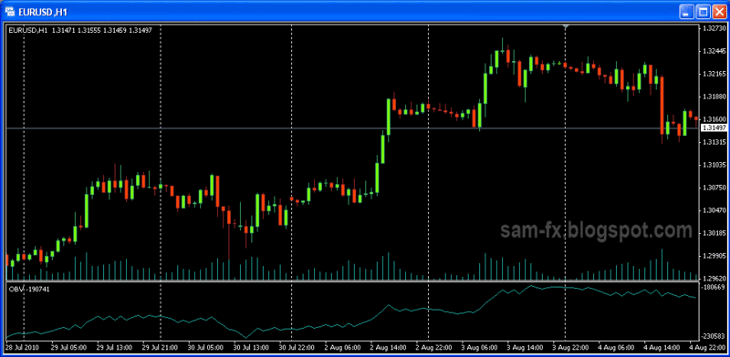
The On Balance Volume Indicator
Calculation
OBV is calculated with the volume and price. OBV starts with 0. When a price is close higher, the volume of that bar is added into OBV. When the price closes lower, the volume is subtracted. Thus the number values in OBV have no significant meaning. What’s more important is the chart pattern and direction of OBV.
Healthy trend / Unhealthy trend
When uptrend occurs, a rising in OBV chart will shows that the trend is strong. This is because there are more volume that support the uptrend. When a downtrend occurs, a downtrend in OBV chart will show that the trend is strong.
Trading OBV trend-line
Trend line can be drawn on OBV, the same way that they are drawn in price chart. Traders look at OBV trend line because they believe in the concept “volume precede price”. Short and long signal are trigger once the trend line are broken. This is the same method use in trend line trading, once of the simplest form of trading.
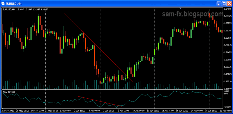
Divergence
Divergence in OBV shows the trend is weakening. This is same method use when looking at other indicators.
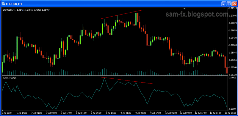
Read more!
Monday, 2 August 2010
Basic: Volume
Volume and price are the 2 purest forms of data in technical analysis. All other indicators are based mostly on price and some on volumes. Unlike the share market, where each share traded is considered to be 1 volume, the volume in forex is calculated differently. This is because forex doesn’t have a centralized exchange, thus the calculation is different.
In forex, the volume is calculated by the amount of movement in the price. The movements are known as ticks. Thus the ticks movement represents a number in volume. Volume in forex measures the “worth” of the market move. Movement that backed by high volume are more significant. There is a saying that says “volume precedes price”, where volume is consider leading indicator.
Healthy Trend & Unhealthy Trend
A healthy trend is a trend backed up by increasing volume data. In an uptrend, an increasing in volume while the trend is moving up is considered a healthy trend. In a downtrend, an increasing in volume while trend is moving down is healthy trend.
A trend with decreasing volume is indication that the trend is weakening. Example in and uptrend, when the volume starts decreasing, the top is near, and the trend might starts to move sideway or reversal soon.
Accumulation
Accumulation is where the bulls take control of the game. In a down trend, accumulation happens when the price start moving sideway (or start moving up slightly), with the pick up on volume. After that reversal is possibly going to happens soon.
Distribution
Distribution is terms to describe the bears take control of the game. In an up trend, distribution is where the trend starts moving sideway (or slightly moving down) with increasing volume. After that reversal is most probably going to happens.
Volume spike and reversal
Area with more volume can be observed as significant support/resistance area. When many volume spikes appear in an area, it is possible that reversal is going to happens. A single spike on the other hand might be caused of news announcement.
Volume and breakout
Volume data can be used to confirm a breakout. Breakout is where the chart starts to move after some chart pattern formation. A breakout with low volume might be fake breakout. A breakout with large volume is more significant, and price is likely to move to targeted profit level.
Volume Based Indicator
Volume based indicator are less common than price based indicators. Here are some more popular volume based indicators.
- Volume bar on the chart on MT4
- Volume
- Money Flow Index
- Market Facilitation Index
- On Balance Volume
- Accumulation / Distribution
Read more!
Tuesday, 27 July 2010
basic: ADX indicator
ADX stands for Average Directional Index. In short, this indicator shows the strength of the trend. ADX is developed by J. Welles Wilder to determine the strength of the trend. Here I would share more about ADX.
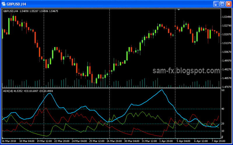
This is how ADX Indicator looks like.
ADX consist of 3 lines: ADX line, +DI and –DI lines. ADX signal will oscillate between 0 and 100. The main ADX line shows the strength of the trend. It does not show is it uptrend or downtrend. The higher the reading is, the stronger the trend. A general rules-of-thumb says ADX reading above 20 shows trending market, where reading below 20 shows ranging market. ADX above 40 shows a very strong trend. The ADX default period is 14. This means it is calculated with 14 previous bars in the chart. However the value can be lower or increase based on personal preference.
The 2 lines in ADX is +DI and –DI. They represent the strength of bulls and bears. They are the positive/negative directional indicators. When +DI is above –DI, the bull is on the upper hand. When +DI is rising, the uptrend is getting stronger. When –DI is above, the bears are stronger. When –DI is rising, this shows the downtrend is gaining strength. The +DI and –DI crossover can be seen as one side is overpowering the other side.
There are many use of ADX. The first is to determine the strength of the trend. Another way of using it is to use the DI line crossover to determine the turn of the trend. And ADX can be referred to determine if the market is ranging or trending; and in that way helping us to decide to refer to momentum indicator or oscillator indicator. Trend line can be drawn on ADX peak to show increasing or decreasing of overall momentum.
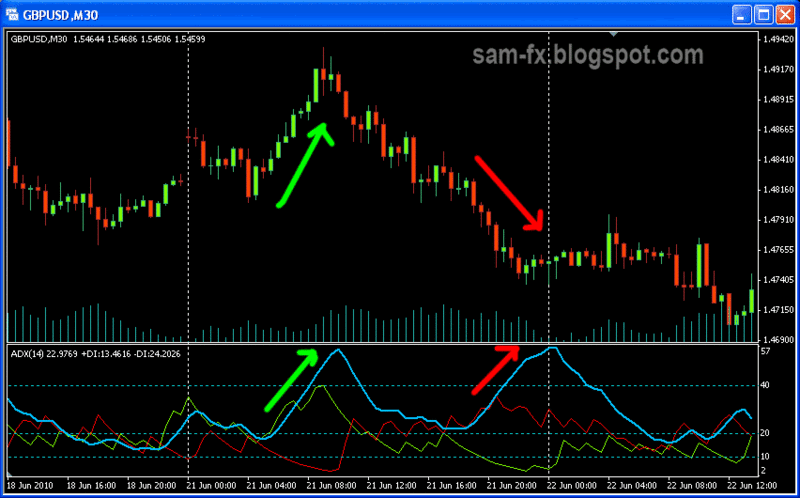
Notice in the picture above, when trend is getting stronger, ADX is rising, no matter its uptrend or downtrend
The ADX formula is beyond discussion of this article. A good source to find the ADX formula is on this page: http://forex-indicators.net/adx
In short, here are some guidelines on using the ADX
- When the ADX is over 20, the trend is strong
- When the ADX is over 40, the trend is extreme
- When the ADX is below 20, the market is ranging
- When the +DI cross above –DI, the bulls are stronger. Uptrend is taking place
- When the +DI is rising, the uptrend getting stronger
- When the +DI is moving down, the uptrend getting weaker
- When the –DI cross above the +DI, the bear are stronger. Downtrend is taking place
- When the –DI is rising, the downtrend is getting stronger
- When the –DI is moving down, the downtrend is getting weaker
- Trend line drawn on the peak of ADX can indicate weakening of overall trend.
- Trend line drawn on the lows of ADX can indicate increasing strength of overall trend
Read more!
Wednesday, 21 July 2010
basic: Relative Strength Index (RSI)
Relative Strength Index (RSI), another momentum indicator which is one of the most indicators for traders. RSI developed by J. Welles Wilder at 1978. It measures the relative strength within the price low and high over a period of time. I often used this together with other indicator such as stochastic for double confirmation. When I first learn Forex I thought RSI just a matter of observing the 30 and 70 levels only, however there are more to it when I learn it deeper. Here I would share more about RSI.
RSI indicator move around between level 0 and 100. It is calculated by the average gain and loss of a price. It is price based indicator, as opposed t o Money Flow Index (MFI) which is volume based indicator. The formula for RSI is beyond the discussion here. There are many different formulas out there, but this one i found at stockcharts.com is the most accurate one. (http://stockcharts.com/school/doku.php?id=chart_school:technical_indicators:relative_strength_index_rsi)
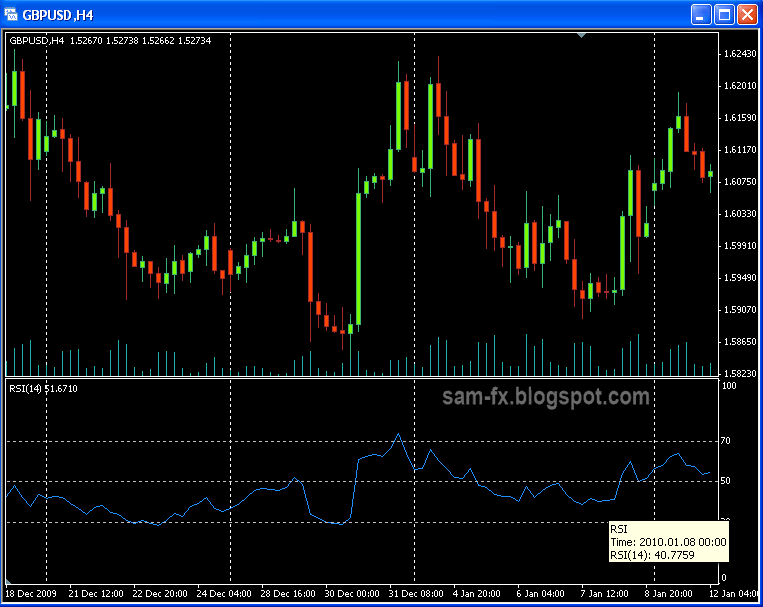 n
nThis is how RSI indicator looks like
Welles recommends the period to be 14, but it can be changed based on traders preference. Besides 14, the most popular period being used is 9 and 25. Lower the period will result in more oscillation, but also increase chances of false signal.
Overbought / Oversold
RSI oscillate between 0 and 100. When the level is over 70, it is considered overbought. When the level is below 30, it is consider oversold.
Traders often take it as short signal when RSI is over 70 and long signal when RSI is below 30. This is not always right things to do because in strong trend, RSI will stay in the oversold/overbought territory for some time. Usually check with candlestick patterns and confirmations with other indicators are needed to make the trade. When RSI move out from overbought/oversold territory, it is good signal to enter.
Divergence
Divergence is another way to use RSI. When price makes a higher high but RSI fail to make a higher high, a reversal is near. When price making a lower low but RSI makes a higher low, a reversal is possible too.
Note that in strong trend, divergences are misleading. In my opinion, RSI shows more misleading divergence compared to stochastic.
Overbought / Oversold
RSI oscillate between 0 and 100. When the level is over 70, it is considered overbought. When the level is below 30, it is consider oversold.
Traders often take it as short signal when RSI is over 70 and long signal when RSI is below 30. This is not always right things to do because in strong trend, RSI will stay in the oversold/overbought territory for some time. Usually check with candlestick patterns and confirmations with other indicators are needed to make the trade. When RSI move out from overbought/oversold territory, it is good signal to enter.
Divergence
Divergence is another way to use RSI. When price makes a higher high but RSI fail to make a higher high, a reversal is near. When price making a lower low but RSI makes a higher low, a reversal is possible too.
Note that in strong trend, divergences are misleading. In my opinion, RSI shows more misleading divergence compared to stochastic.
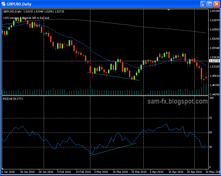
The price is making a new low, but the RSI is making higher low.
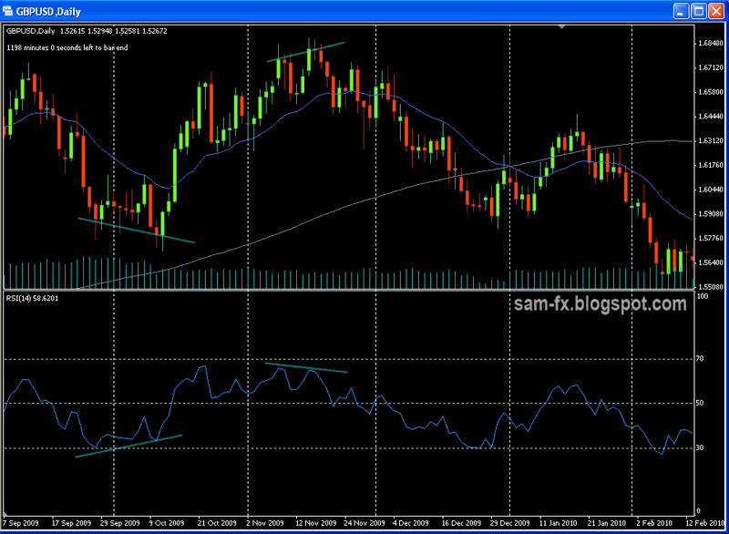
Another view of divergence
Centre line crossover
The level 50 line is good area to determine bullish and bearish trend. When RSI fall below 50, the bear is stronger, when RSI rise above 50, the bull is stronger. On a moving trend, RSI crosses the 50 level is a confirmation of trend movement.
The level 50 line is good area to determine bullish and bearish trend. When RSI fall below 50, the bear is stronger, when RSI rise above 50, the bull is stronger. On a moving trend, RSI crosses the 50 level is a confirmation of trend movement.

Bearish center line cross over
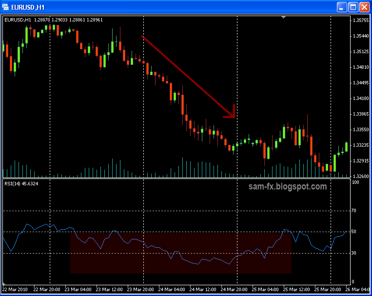
Bearish center line cross over
RSI trend line
Another way to use RSI is drawing trend line at RSI indicator itself. Similar to trend line trading, but the line is drawn on the RSI signal line. This is useful because reversal on the trend line often seen earlier in RSI then at the price chart.
Another way to use RSI is drawing trend line at RSI indicator itself. Similar to trend line trading, but the line is drawn on the RSI signal line. This is useful because reversal on the trend line often seen earlier in RSI then at the price chart.

RSI trend line. Not always easily visible
Failure swings
Failure swing is not related to price chart. A bullish failure swing is when RSI dip below 30, bounce up, then down again, and when the line cross the previous height, this is failure swing. The opposite happens for bearish failure swing. Failure swing is a good signal on possible reversal of the trend.
Unlike the stochastic, signals in RSI are rare and harder to spot. But once they appear, it can be very significant. Use it wisely and it may bring you many profitable trade.
Read more!
Tuesday, 20 July 2010
basic: Bollinger Band
Bollinger bands, a nice indicator developed by Mr. John Bollinger in the 80s. This is among the most used indicators in stock market and also in Forex market. It is one of the best indicators to measure market volatility and trend. Although I have not much experience in Bollinger band, I would like to write about it here, since I just study some details lately.
Bollinger band is series of 3 lines. The middle of the band is actually simple moving average. Mr. Bollinger recommend that using 20 as the period for the SMA. The upper and lower line is actually standard diviations from the SMA. Around 80% of the time the price will move around within the upper and lower band (with deviation of 2), as if a ball bouncing within the 2 wall.

Photo above is bollinger band, with deviation of 20.
Market volatility
The Bollinger band gives picture of market volatility at a glance. When the 2 bands are future from each other, the market is more volatile. When the 2 band are getting closer to each other, the market tends to be less volatile.
Overbought / oversold (Bollinger band reversal)
When price reach the upper band, it is said being overbought; and when price reach the lower band, it is said being oversold. Most of the time price tends to bounce within the 2 bands.
Many traders use this as buy/sell signal: going long when price touch or penetrate lower band; going short when price touch the upper band. Some might even doing very well with this method, as 75% of the time the market is ranging. The price tends to move between the 2 bands when market is ranging.
However this would be a bad method at trending period. As Mr. John Bollinger points out, many times the price will "Rides the band". ("tags of the bands are just that - tags, not signals. A tag of the upper Bollinger band is not in and of itself a sell signal. A tag of
the lower Bollinger band is not in and of itself a buy signal". Price often can and does "walk the band")
So to use the "bouncing" method, confirmations from other indicator are necessary. Usually combination with another momentum indicator (e.g. RSI, stochastic) makes a good confirmation.
This works best in ranging market. The Bollinger band tends to work as mini supports and resistance area for the price.

Notice on the chart above, the price tends to bounce between the 2 band before breakout
Breakout (Bollinger band squeeze )
When the Bollinger band contract or squeezed, a breakout often occur after. This happens when market went through low volatility period when the bulls and bears are competing, and when 1 side takes over, the move tends to be big.
Usually when price starts to break above the band, it will continue it move upward and vice versa for lower breakout.
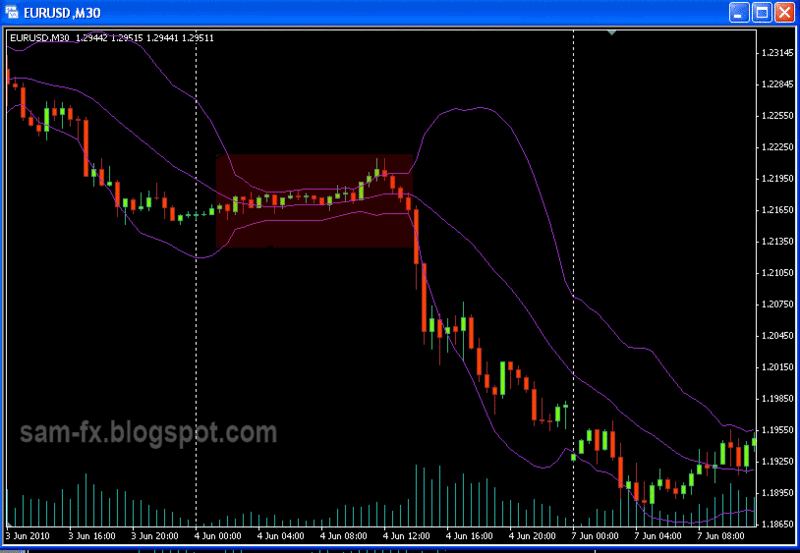
A breakout occur after bollinger squeeze (red area).

Another breakout and continuation occur (green area) after Bollinger Squeeze (red area)
Strong trend (Bollinger band continuation)
On strong trend, the price most often wont 'bounce' on the Bollinger band; but continue to move along side the band. It is important to identify is there high possibility for a bounce or continuation.
When price breaks the upper band, if the upper band is pointing upward in the same time, there are high possibility continuation is happening. Price is more likely to continue to move upwards.
When the price breaks the lower band, if the lower band is also pointing downward, there are high possibility continuation is happening. Price is more likely to continue to move down.
Changing the Bollinger Band period
The period (default 20) can be change based on different types of markets. 2 most popular periods is 20 and 14. On less volatile market, lower the period can makes movement easier to identify. A period that is too short will give more false signal. Bollinger band with longer period will appear wider than the shorter period Bollinger band.
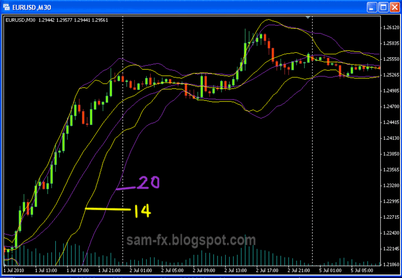
Bollinger band with period of 14 (yellow) versus period 20 (purple)
Multiple bands
Multiple sets of Bollinger Band can be used together to give different meaning. There are many trading methods that involve multiple Bollinger Bands.
In example below, 2 sets of Bollinger Band is used, one with 1 as deviation and another is 2 as deviation. The area outside Bollinger band 1 and inside Bollinger band 2 is considered as buy/sell zone.
When price move inside Bollinger band 1 it is good exit signal.
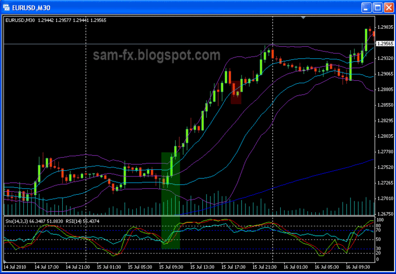
Using 2 Bollinger Band; when the first breakout occur, confirm with Stochastic and enter the market (green area). When the price close inside Bollinger 1, exit is trigger (red area)
Above is what I have learnt about the Bollinger Band. Please feel free to post in your comments and opinions.
Read more!
Monday, 19 July 2010
basic: Stochastic
Stochastic, this is an oscillating indicator (as oppose to trending indicator). This is one of the most popular indicators out there. For me this is my favorite indicator. Many times this amazing indicator has helped me avoid bad trades, and spot a high profit entry. Developed by George C. Lane in the 50s, according to him, this indicator doesn't follow the volume or price, but the momentum of the price. As another article describe, "as a accelerating rocket climbs up, it will loose acceleration, slows down, before it starts falling". Stochastic is best used to show the weakening of momentum and point out the possible reversal signal. Let’s goes deeper into this indicator.
Fast, slow, full stochastic
Stochastic indicators is lines oscillating between 0 and 100 level. The 2 lines labelled as %K and %D. Usually we call the %K as “fast line” and we call the %D “Slow line”.
Stochastic first developed by George C Lane as "Fast Stochastic". On fast stochastic, there are 2 lines, %K and %D. There are 2 inputs for the fast stochastic, first is the period (default is 14); and second is the smoothing of %D line (by default is 3). The %K and %D line is calculated by this formula:
Stochastic indicators is lines oscillating between 0 and 100 level. The 2 lines labelled as %K and %D. Usually we call the %K as “fast line” and we call the %D “Slow line”.
Stochastic first developed by George C Lane as "Fast Stochastic". On fast stochastic, there are 2 lines, %K and %D. There are 2 inputs for the fast stochastic, first is the period (default is 14); and second is the smoothing of %D line (by default is 3). The %K and %D line is calculated by this formula:
- %K = (Current Close - Lowest Low)/(Highest High - Lowest Low) * 100
- %D = 3-bar SMA of %K
where a period is given (by default, 14) the lowest low and highest high is within the period.
The %K line will be very choppy on fast stochastic, where George Lane will enter and exit the market based on the %D line. Later on, the Slow Stochastic was developed.
In slow stochastic, the %K line is smoothed out (by 3 SMA). The 2 parameter for slow stochastic is the period (by default 14) and the smoothing of %D line (by default is 3). The slow stochastic is more reliable because the %K line is smoothed out. What we have in slow stochastic is:
- %K = 3-bar SMA of fast-stochastic-%K
- %D = 3-bar SMA of %K above
What we mostly have now in our software is the Full Stochastic. Full stochastic is basically the same as slow stochastic, but there are 3 input parameter:
- input for period (by default, 14, or 5),
- smoothing for the %K line (by default, 3),
- parameter to calculate the %D line (by default, 3).
The only difference between full stochastic and slow stochastic is the smoothing of %K line can be customized.
(P.S.: Many articles saying that, default stochastic 14,3,3, is stochastic for 14 days. There is a misconception there, the 14 period is determine by candles. If we using daily chart, it will be 14days. If we are using hourly chart, it will be 14 hours)
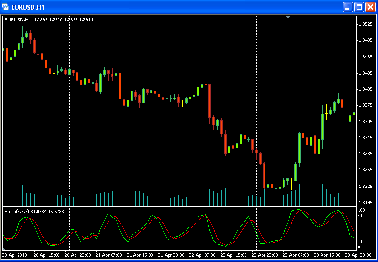
This is how a stochastic (5,3,3) looks like
Overbought / Oversold.
The lines at stochastic oscillate between level 0 and 100. When it’s above level 80, we consider the market is overbought. When it’s below the level 20, we consider the market is oversold. This does not mean that we will go short when the stochastic shows 80 and above, and vice versa. On some strong trend, the stochastic will stay above 80 (or below 20) for some times and reversal not happening.
How I use this level is, consider them as my ‘non trade area’. When the stochastic shows 80 and above, I would think twice before going long. When the stochastic shows 20 and below, I would think twice before going short. This helps me filter out some of the bad trades.
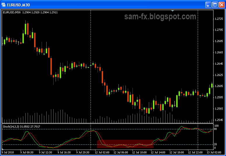
Notice how in strong trend, the stochastic tends to be choppy and stays below 20 level.

In this example, the stochastic stays above the 80 level for some time
Crossover
The %K line in stochastic is considered as bullish; the %D line is considered bearish. When the %K line cross above the %D line and the stochastic is moving up, the market is turning into bullish market, vice versa for bearish market. However I do not jump into the market straight away when the lines cross. Usually confirmation is needed before we can confirm the reversal is happening.
How I use this is, when the stochastic is at above 80 level, I wait for the %D to cross the %K, then when they crossover and move down into below 80 level, its good sign to go short; vice versa for going long.

Some good place to take a short (red circle) and long (green circle)
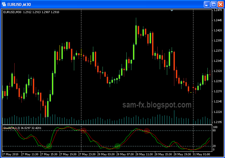
Another example showing possible short (red circle) and long (green circle) area
Divergence
Divergence is another good way to use stochastic indicator. In a bullish trend, when price making a new high while stochastic making a lower high, there is good chance of reversal. When the price making a lower low but the stochastic making a higher low; there is chance of reversal.
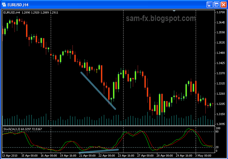
Price are making new low, but stochastic are making higher low. A divergence.
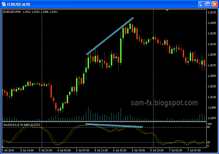
Price is making new high, stochastic making lower high. A divergence
Time
As BK mention in his webminar, here is another way to use stochastic. The market is like a football game between the bear and the bull. When the %K line is above the %D in stochastic, the bull is holding the ball, and vice versa for the bear.
Watching the stochastic indicator, we can estimate if the bull is stronger or bear is stronger. We estimate this by checking on who is ‘holding the ball’ for longer period of time.
There you go few tips and information about the stochastic indicator. To recap, here is some important part
- When the stochastic is above 80, its ‘no long’ zone, think twice and confirm with other indicators before going long.
- When the stochastic is below 20, its ‘no short’ zone. Think twice and confirm with other indicators before going short.
- When the stochastic is above 80, if the %D is cross above %K; and they are moving out to below 80 level, its good sign to go short
- When the stochastic is below 20, if the %K is cross above %D; and they moving out to above 20 level, it is good sign to go long.
- Divergence is useful way to monitor possible reversal on the price.
Reference:
- Stockcharts.com (http://stockcharts.com/school/doku.php?id=chart_school:technical_indicators:stochastic_oscillator)
- Forex-indicators.net (http://forex-indicators.net/stochastic)
Read more!
Friday, 16 July 2010
basic: MACD
MacDonald? Oh we are not talking about fast food here. (But thinking about their burger makes me feel hungry while typing this.) Yeah, MacDonald, is called MAC D in short form in my countries, with many advertisement saying/singing "macd"... Too off the topic I guess, in
this post I would like to talk about MACD indicators, developed by Gerald Appel.
MACD stands for Moving Average Convergence Divergence. As the name implies, it show the Convergence and Divergence of 2 moving average. Its one of the most used technical indicators out there. What make MACD so good is that it shows the convergence and divergence in once glance. Beside that the oscillation of MACD signal line can show
convergence and divergence between itself and the price too.
Let’s looks at what makes out the MACD indicators. The default value would be “12, 26, 9”, which is 12 EMA of the price chart, 26 EMA of the price chart, and 9EMA of the MACD signal. The value 12, 26, 9 can be changed to other value to suits your trading needs. For me I would stick to the default.
In general, MACD indicator will consist of the following:
- ”Fast line”, or sometime called “MACD”; which is difference between 12 EMA and 26 EMA on the price chart
- “Slow line”, or sometimes called “signal line”; which is 9 EMA of the MACD (a.k.a. “fast line”)
- Histogram: the difference between the fast line and slow line.
Reference:
babypips.com (http://www.babypips.com/school/macd.html )
ivestopedia.com (http://www.investopedia.com/terms/m/macd.asp)
incrediblecharts.com (http://www.incrediblecharts.com/indicators/macd.php )
stockcharts.com (http://stockcharts.com/school /doku.php?id=chart_school:technical_indicators:moving_average_conve )
What makes beginner like me confuse is that different article talk about MACD in slightly different form. Some of it with histogram, some of it doesn’t, some with different lines, etc.
To add on to the confusion for beginner like me, the default MACD inside Metatrader is totally difference from the source above. In MetaTrader, the MACD consist of
- “signal line”, which is 9EMA of MACD
- Histogram, which represents the difference between 12 EMA and 26 EMA on the price chart
Yes, I was pretty confused last time. Then I notice that all those difference, they all don’t matter. The default MACD in Metatrader can be as efficient as other variant of MACD out there. Let me describe how to use MACD here without worrying about all the variants. First let’s load up the default MACD in our Metatrader. It looks totally different from the MACD we saw on different articles. With some studies I found out what that histogram represents. Refer to the screen capture below on my chart; I have plotted out 12 EMA and 26 EMA on the price chart.
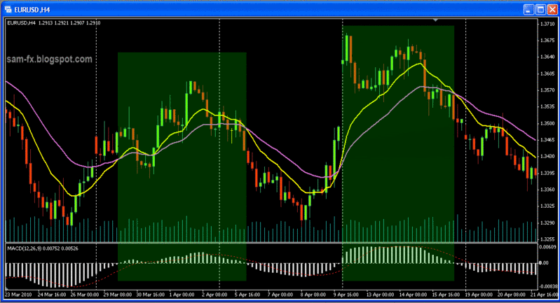
MT4 MACD, with 12EMA (yellow) and 26 EMA (purple)
Notice that when the 12 EMA (yellow) and 26 EMA (purple) diverge (separate) from each other, the histogram goes longer. Notice when 12 EMA is above 26 EMA, the histogram goes above the 0 line (I have mark it in green box); and when 12 EMA cross below the 26 EMA, the histogram goes below the 0 line. In Metatrader, the histogram replaces the traditional MACD line. Now let’s look at below to see how to spot a “MACD crossover”
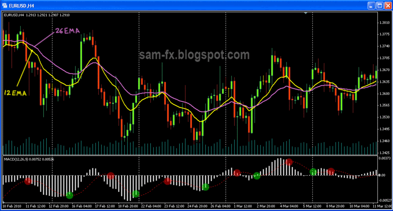
Spot for MACD crossover (red and green circle) on MT4 default MACD
In traditional MACD graph, the crossover happens when MACD cross the signal line (9 EMA of itself). Since the Metatrader default MACD is replaced with histogram, we will spot the crossover when the line crosses the histogram. On the above screen, I have mark the cross with green and red circles. The Screen below shows the different between traditional MACD graph (bottom indicator window) and Metatrader MACD graph.
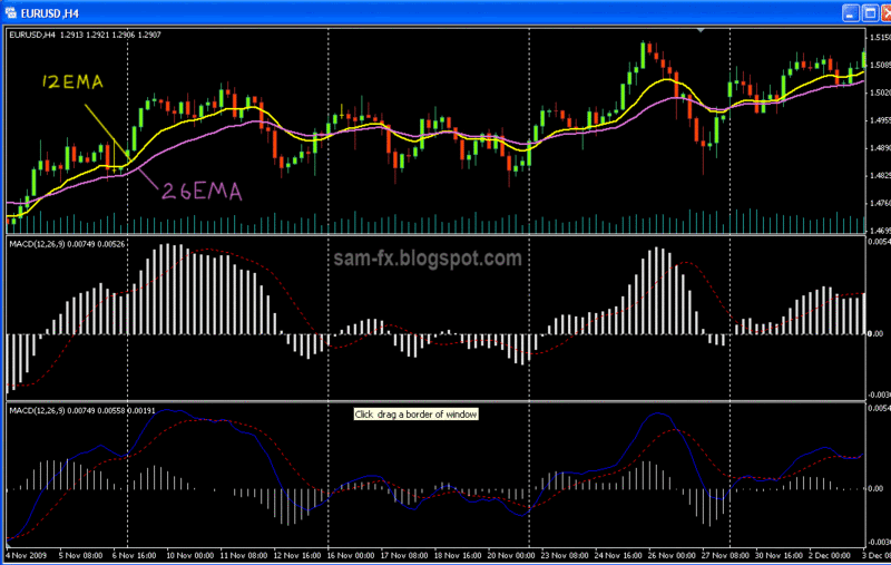
Difference between MT4 default MACD and a 'traditional' MACD (below)
I have mark out some of the point when look at a traditional MACD indicator and Metatrader MACD indicator. Here are few points to take note:
- When look for MACD signal line cross, in MT4, we look for the line cross the histogram (red and green circle)
- when look for 12 and 26 EMA cross, in traditional MACD, we look for MACD signal to cross the zero line; in MT4, we look for histogram to cross the zero line. (blue circle)
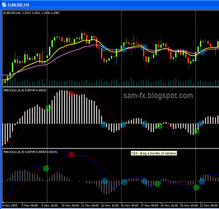
Spot the crossover in different MACD indicators
Here are some tips on using the MACD indicators:
- when the fast line cross below the slow line, and start diverging, it shows strong bearish sign
- when the fast line cross above the slow line, and start diverging, it shows strong bullish sign
- when MACD is positive and rising it means increasing acceleration of the uptrend
- when MACD is negative and decreasing it means increasing acceleration of downtrend
- when MACD moving above positive, in the same time the fast line is above slow line, its bullish signal
- when MACD move below positive, in the same time fast line fall below slow line, its bearish signal
- when MACD and price are diverging, reversal maybe is near (when price reach a new height but MACD show lower height; when price hit a new low but MACD shows a higher low)
- when MACD rises or decrease dramatically, its said that its
- overbought/ oversold, we should be careful of retrace
Trade with above tips, and you will loose money. What I meant is MACD is not to be used alone. Used it with your price pattern and other indicators, and you will have a profitable trade.
There you go, some details on MACD and also MT4 default MACD. Let us start trading with our favourite MACD setting.
Read more!
Thursday, 15 July 2010
basic: Moving Averages
Moving average, one of the simplest and most widely use indicator in
technical analysis. How well do you know your MA? Here I will share
with you what I have learn, and what I have observed about SMA and
EMA. Feel free to drop in your comments too.
As the name applies, Moving Average is average of the past price. With
the advance of charting software, the average can be apply to candle
close, open, high, or even low. But usually we will use moving average
that’s applied to candle close. The MA is calculated each time new
candle opens, thus its 'moving' along with the price. Moving average
means average of the past days, a 13 moving average means average of
past 13 candles. A 5-MA in a daily chart will be average of the past 5
days; while 5-MA in an hourly chart will represents the average of the
past 5 hours.
SMA (Simple moving average) is average of the previous price. Example
13 SMA will take the average of the past 13 candles; adding up the
closing price of past 13 candles and divide it by 13. The SMA are
usually more “smooth out” then EMA, and usually consider to be more
lagging.
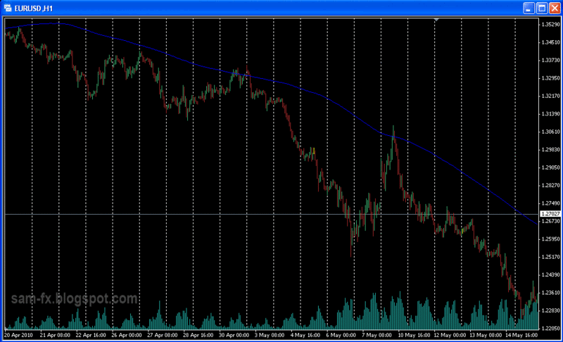
The SMA200 (Blue Line). Notice how price tends to find resistance on it several times on the chart above.
EMA (Exponential Moving Average) puts more weight on recent price. EMA
is similar to SMA but is more sensitive to price movement. Thus at
first glance, EMA will looks more 'choppy' compare to the 'smooth out'
SMA. EMA put certain percentage on recent price, example 30% for
today's candle and 70% for the past few days candles. To obtain the
percentage, the charting tools use this formula : 2 / (period + 1);
example in 5 EMA, the percentage will be 2 / (5 + 1) = 33.3%, so 33%
weight will be given for current candles and 66% will be given to past
4 candles in the average calculation.
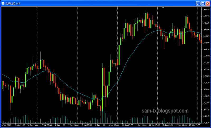
The EMA-21, light blue line. Notice price tends to move close to it.
There is no limit on what value to set on your EMA/SMA; and you may
set it to open, close, high, low of a candle. However here I list down
few of the more famous MA.
- 5, 13, 62 EMA (Rob Booker 5-13-62 system)
- 20 EMA
- 21 EMA ( fxKnight describe it as 'center of universe, as price often
- oscillate around it)
- 50 EMA
- 144 EMA
- 200 SMA
- 200 EMA ( one of the trading strategy at vitastop.com involving 200EMA )
- 250 EMA ( one of the forum user likes to use this with 50EMA cross )
- Multiple EMA, the GMMA trading strategy, created by Daryl Guppy
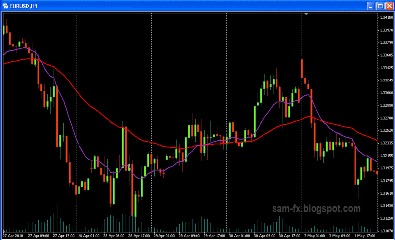
The EMA 5, in purple; and EMA13, in red. Notice price crossed each other several times.
There are many uses of Moving Averages, here I would share some tips
on usage of MA
- identify a long term trend (longer period SMA / EMA)
- identify a short term trend (shorter period EMA)
- acting as support / resistance area (especially for longer period,
- such as 200SMA)
- when shorter MA crosses above longer MA, its sign of uptrend, and
- vice-versea for downtrend
- when shorter MA crosses above longer MA and diverge from it, its sign
- of strong uptrend, and vice-versa for downtrend
- when shorter MA are above longer MA, and converge nearer, it means the
- up/down trend is slowing down
- when price is moving above EMA, its sign of strong uptrend. Vice versa
- for downtrend.
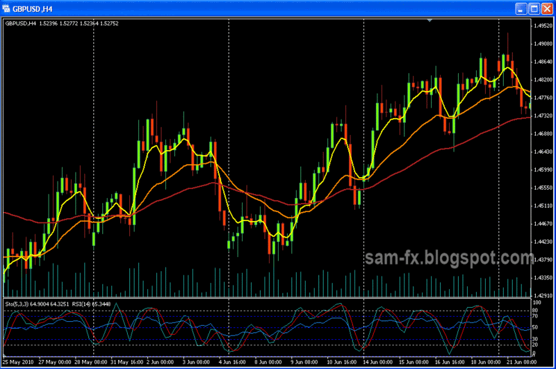
The EMA 5 (yellow), EMA 21 (orange), and EMA55 ( brown). Notice they tends to cross each other at several points.
There you go, few tips and tricks about MA. Lets start trading with our favorite MA combination now.
Read more!
Tuesday, 13 July 2010
basic: more candlesticks
In the last posting I talk about some of the most common candlesticks pattern. Here I would like to talk a few more common candlestick combination. Hope this will help out everyone who starts learning forex. The photos below are screen capture from my charting software. Please feel free to leave your comments.
Star position

Star position is where a candlestick with small body appears gap up (or gap down) from the previous candlestick. The first candlestick should have large body, while the second candlestick should have fairly small body. The second candlestick can be a Doji, Hammer/Inverted hammer, hanging man or shooting star.
The star position usually means there is potential reversal happening.
Harami Position (孕み)
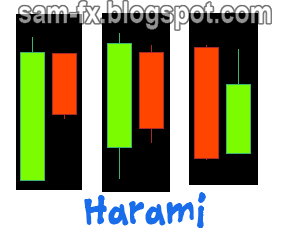
Harami, means “pregnant” in Japanese. In this position, the second candle is fully ‘enclosed’ in the fist candle. The first candle should have fairly large body, and the second candle body (and usually the shadow too) should be within the body of the first candle.
Harami used to confirm a reversal that is happening. The color of both candlesticks should not be important. The color can be in any of the 4 combination.
Engulfing
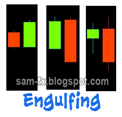
Engulfing is a pattern where the second candle fully ‘engulfs’ the first candle. In a bullish engulfing, the open of the second candle is lower than the low of first candle, while the close of the second candle is higher than the high first candle.
In a bearish engulfing, the open of the second candle is higher than the high of first candle, and the close of the second candle is lower than the low of the first candle.
Usually engulfing means a potential reversal is happening. Confirmation with indicators and subsequent candles are required on the reversal.
Piercing / dark Cloud Over
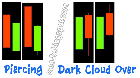
These 2 are also potential reversal pattern. A piercing is pattern with 2 candles, the open of second candle is lower than the low of first candle, and the close of the second candle should be above the ½ body of the first candle.
In the dark-cloud-over formation, the open of the second candle should be higher than the high of the first candle, and the close of the second candle should be lower than half of body of the first candle.
Read more!
Monday, 12 July 2010
basic: Talk candle, eat candle, sleeps candle, dream candle
In my previous post I have describe the anatomy of a candlestick, and also the Doji candlestick. There are many more candlestick patterns out there; there are even more candlestick formation out there to study. Here I would highlight some of the more common candlestick patterns for you.
The Doji have been mentioned in the previous blog. Its one of the most significant candlestick patterns out there.
The Marubozu (まるぼず)

The Marubozu is a candle with long body and no shadow/wicks. Sometimes there will be shadow but usually its very short. If Marubozu candlestick is real person, it will be like “Yao Ming” in the real world, very tall.
The Marubozu usually means the bullish/bearish trend is strong, and usually (but not always) signal a continuation. Marubozu with shadow are significant too, usually the shadow are short. A “closing Marubozu” have stronger meaning then an “opening Marubozu”. A “closing Marubozu” is a Marubozu which have a short shadow only at the the opening end; and vice versa for the “opening Marubozu”.
Spinning tops
 These are candlestick that similar to a Doji. The difference is they have a very small body (oppose to Doji which do not have a body) and a very long top/bottom shadow.
The appearance of spinning tops after a trend means the trend is weakening. It might be a sign of reversal. Using it with indicators will give you higher accuracy on spotting a reversal.
Hammer / Hanging man
 A hammer or hanging man candlestick looks the same. They have a very long lower shadow; very short or non-existence upper shadow, and a very small body. They can be black or white (red or green) candles. We call them “hammer” when they appear at end of downtrend, and we call them “hanging man” when they appear at end of up trend.
Usually the appearance will signal a reversal. But we will need to wait for confirmation candlestick and also with help of indicators.
Inverted hammer / shooting star
 These 2 candles are the same. They have very long upper shadow, a very short body, and very short or non-existence lower shadow. We call them “inverted hammer” when they appear in downtrend, and we call them “shooting star” when they appear in uptrend.
Usually their appearance will signal a reversal. But we will wait for a confirmation candle, and also with the help of indicators.
There you go, few of the more common candlesticks. At next post we will goes into candlestick formation.
Here are some readings to boost your knowledge on candlesticks.
The Doji have been mentioned in the previous blog. Its one of the most significant candlestick patterns out there.
The Marubozu (まるぼず)
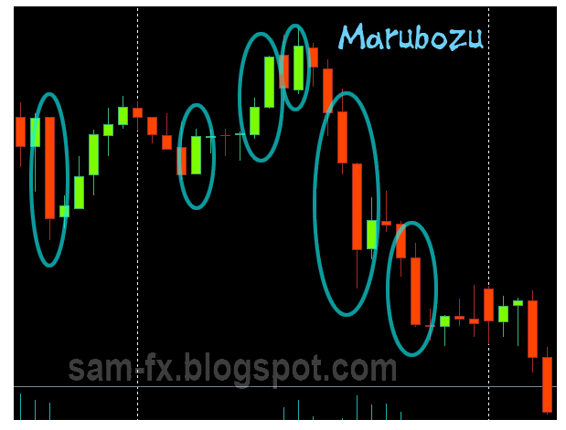
The Marubozu is a candle with long body and no shadow/wicks. Sometimes there will be shadow but usually its very short. If Marubozu candlestick is real person, it will be like “Yao Ming” in the real world, very tall.
The Marubozu usually means the bullish/bearish trend is strong, and usually (but not always) signal a continuation. Marubozu with shadow are significant too, usually the shadow are short. A “closing Marubozu” have stronger meaning then an “opening Marubozu”. A “closing Marubozu” is a Marubozu which have a short shadow only at the the opening end; and vice versa for the “opening Marubozu”.
Spinning tops
The appearance of spinning tops after a trend means the trend is weakening. It might be a sign of reversal. Using it with indicators will give you higher accuracy on spotting a reversal.
Hammer / Hanging man
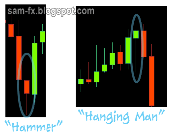
Usually the appearance will signal a reversal. But we will need to wait for confirmation candlestick and also with help of indicators.
Inverted hammer / shooting star
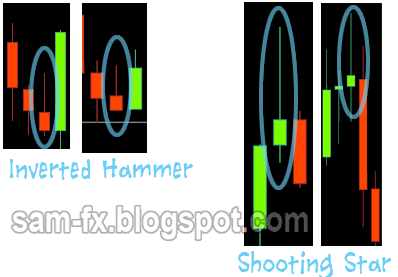
Usually their appearance will signal a reversal. But we will wait for a confirmation candle, and also with the help of indicators.
There you go, few of the more common candlesticks. At next post we will goes into candlestick formation.
Here are some readings to boost your knowledge on candlesticks.
Read more!
basic: CandleSticks
The Candlestick Chart was invented by the ancient Japanese to monitor price movement of the rice. Thanks to Steve Nison who brings it to modern trading world, the Candlestick is now serving many traders out there. Here I will share the very basic of the candle stick with some of my own illustration for easy understanding.
A candlestick, similar to a bar chart, represents OHLC (Opens, high, low, close). Below is illustration of the candle stick.
 The top part and the bottom part is called the “wick”, or “shadow”. The very top and very bottom represents the high and low during the period.
The wide part in the middle is her “body”. The body is between the open and close price. Candlestick may have different color body, or hollow/solid body to represents higher opens, lower close, or lower opens, higher close.
At a glance of series of candlesticks with their different colors and size, it can give a good picture of how the price behaves. Candlestick with different body size and different shadow size will give a clue on the price movements too.
The Doji (どじ)
This is one of the most significant candlestick patterns around. Basically it’s a candlestick where the open and close prices are the same. Usually they are in the form of “+”. But they could be a form of “-“(no price movement at all);
“T” (same open and close, with lower price movement in between, “dragonfly doji”);
“_|_” (same open and close, with higher price movement in between, “gravestone doji”);
Below are some “Doji” I screencaptured from my charting software.

Many articles saying that Doji appeared will represents reversal is near. From my experience this is true sometimes. The Doji might mean continuation too. What I usually do is waiting for the next candle to close to make my judgment. The Doji appear after a rally meaning that one side of the bulls/bears are exhausted, it might means a reversal (the other side power up), or it might means a continuation too (taking a pause). The way to be sure is to wait for next candle close to confirm it.
Read more!
A candlestick, similar to a bar chart, represents OHLC (Opens, high, low, close). Below is illustration of the candle stick.
 The top part and the bottom part is called the “wick”, or “shadow”. The very top and very bottom represents the high and low during the period.
The wide part in the middle is her “body”. The body is between the open and close price. Candlestick may have different color body, or hollow/solid body to represents higher opens, lower close, or lower opens, higher close.
At a glance of series of candlesticks with their different colors and size, it can give a good picture of how the price behaves. Candlestick with different body size and different shadow size will give a clue on the price movements too.
The Doji (どじ)
This is one of the most significant candlestick patterns around. Basically it’s a candlestick where the open and close prices are the same. Usually they are in the form of “+”. But they could be a form of “-“(no price movement at all);
“T” (same open and close, with lower price movement in between, “dragonfly doji”);
“_|_” (same open and close, with higher price movement in between, “gravestone doji”);
Below are some “Doji” I screencaptured from my charting software.
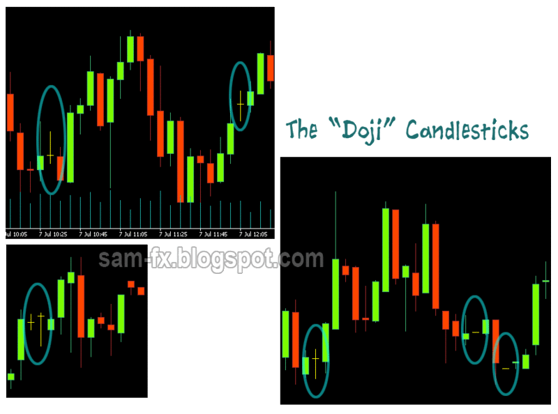
Many articles saying that Doji appeared will represents reversal is near. From my experience this is true sometimes. The Doji might mean continuation too. What I usually do is waiting for the next candle to close to make my judgment. The Doji appear after a rally meaning that one side of the bulls/bears are exhausted, it might means a reversal (the other side power up), or it might means a continuation too (taking a pause). The way to be sure is to wait for next candle close to confirm it.
Read more!
Subscribe to:
Posts (Atom)